A little UX goes a long way
Two weeks to improve Shelter’s ‘Donate’ journey and increase the click-through rate (CTR) by 43%.
Shelter is a charity that campaigns to end homelessness and bad housing in the UK, and provides advice, information and advocacy to people in need.
In September 2021, during a two-week gap between other UX work I was doing for the charity, Shelter’s Income Generation team asked me to continue a piece of research into the performance of their ‘Donate’ landing pages that had been previously cut short.

My mission was to explore ways to improve the click-through rate (CTR) from their landing pages. By improving the CTR, Shelter hoped to generate higher donations.
To onboard me to the project, the team at Shelter gave me the following:
- Data collected from various analytics tools and heatmaps
- A Miro board with earlier benchmarking research
- A list of their assumptions
They had a lot of assumptions about why the CTR was low. Potential reasons included:
- Poor choice of images on the ‘Donate’ pages
- The content didn’t make a compelling case for users to make a donation
- The prompt values — the amount users might want to donate — were either too high or too low
- The ‘Donate’ component was hard to use
Secondary research
Competitor analysis
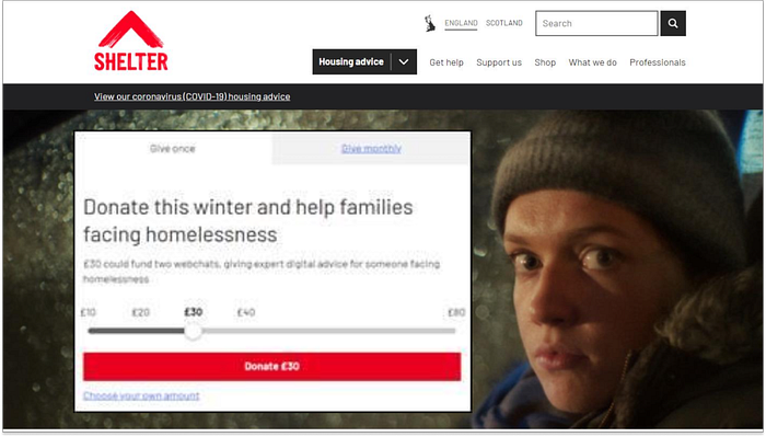
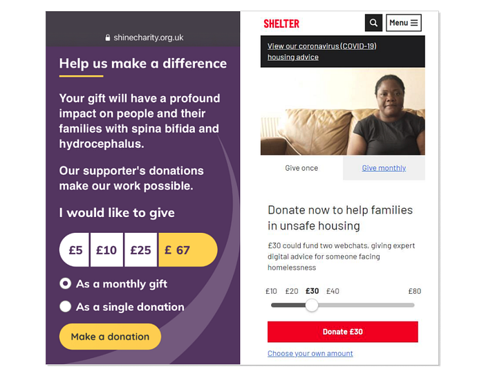
After analysing the hypothesis and research already conducted by the Shelter team, I examined how similar charity organisations were soliciting donations on their websites. My goal was to benchmark Shelter’s donation approach (which you can see below) against an example of another charity that seemed to be effectively using an online “Donate” feature.

Heuristic evaluation
I conducted a quick heuristic evaluation and found that the component being used by Shine could improve upon what Shelter was doing. The heuristics used for this decision included:
According to Jakob Nielsen’s first law, it’s important to make the system’s status visible to users. Shelter’s use of tabs (with links) for selecting between monthly or one-off donations was confusing, while Shine’s use of radio buttons made it clearer.
Fitts’ Law states that touch targets should be easily accessible through their position in the interface. However, the Shelter component requires users to travel up to select a frequency and then down to the slider to select an amount, which takes more time compared to Shine, where users only need to travel down to select the amount, followed by the frequency and CTA Donate. The H1 text on the Shelter component (below, right) broke the Gestalt proximity principle, as it was placed between action points on the page. This goes against Jakob Nielsen’s law #8, which states that aesthetic and minimalist design should keep the content and the UI focused on the essentials.
User testing
I decided to hold a user testing session comparing the journey around the ‘Donate’ component on the Shelter website to the same journey on the Shine website, which I felt scored higher in the heuristic evaluation.

The method
I created a testing script that provided the necessary information. Unmoderated remote testing has several benefits, including gaining more insight into user opinions and allowing users to speak their minds truthfully while avoiding the Hawthorne effect, where study participants change their behaviour just because they are being observed. However, it’s important to thoroughly check the script before using it.
To balance out the bias of learnability, I decided to run the test in 2 groups of 3 people:
- Group 1 tested Shine’s link first and then Shelter’s
- Group 2 tested Shelter’s link first and then Shine’s
I made a screener to find the best candidates. Most Shelter donors are 35–40 years old, but I expanded the range to 35–50 so we can also reach people who might struggle with digital products due to age-related disabilities or lack of familiarity with new technology.
Shelter’s Income Generation Usability Test Report
Methodology:
- Remote unmoderated usability testing
- 6 participants
- Tool used: Userlytics
- Mobile-only
Goals:
*To uncover usability issues of the ‘Donate’ path on mobile devices
Specifically to see if the users could:
- Interact with the slider to choose a sum to donate
- Understand the differences between ‘Give monthly’, ‘Give once’ and ‘Choose your own amount’
- Fill in the final form without any restrictions
*To test this journey against a similar journey on a competitor’s website that we assumed works better than ours
I gave users the following tasks to perform:
- Go to the ‘Donate’ page and select to give £10 monthly
- Change your mind and decide to donate £35 as a one-off
- Fill in the payment form without adding your real details
‘Shine vs Shelter’ — Findings
I created a Miro board with testing results grouped by tasks, participants, and charity donate journeys. Green post-its indicate positive feedback, red means negative, and yellow lies in between. The density of green post-its shows which journey and segment performed better.
Summary of findings
The main issues with the journey were shown to be:
- Complexity of slider component
- Users didn’t understand the functions. They had difficulty:
-Selecting custom values
-Selecting frequency
- It took users longer to complete the task than it should — increasing the likelihood of drop off
- The form performed relatively well with some small amends suggested
Quotes from the testers
- ‘It’s not obvious (Choose your own) — maybe should be a section above?’ (Shelter)
- ‘I think it would be better if you could make it clear which tab you are on’ … needs ‘An extra indication’ (Shelter)
- ‘I like the fact that you have two very clear buttons there to select monthly or one-off payments’ (Shine)
- ‘Very easy to confirm exactly how much I’m donating’ (Shine)
Implementation: My recommendations
Based on the findings and user feedback, I proposed the following changes to implement:
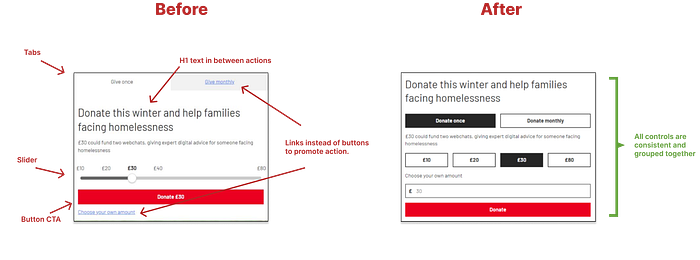
- Replace the Slider option with the Button option, making it clear to a user that you can ‘add your own amount’ by clicking on a button
- Make clear to the user the choice between ‘Monthly’ and ‘Once’
- Ensure all controls sit between H1 and the primary donate button
- Consider using Shelter colours to add contrast and facilitate visual comprehension of status
- On the form, consider automatic detection of card format and type
- Also on the form, consider implementing address lookup based on postcode
You can see in the image below how these changes impacted the design of the component.

The results in numbers
The goal of the project was to improve the CTR by at least 1%. I’m delighted to say that after the proposed changes to the ‘Donate’ journey were implemented, the CTR went up ~43% YoY.
We achieved significant improvements by making a low-risk modification in record time.
If I could do it all again
If I had the chance to repeat this test, I would balance the sample group evenly between men and women, as there was a noticeable gender imbalance in our test group, with only one woman and five men.
I would improve form testing since users had difficulty understanding it, and some users’ devices automatically populated their personal data before they could input anything.
Finally, I would involve more team members in the debriefing sessions to ensure that any issues related to their expertise are identified and addressed.
